Instant Elegance Through Intelligent Light

Today we dive into smart lighting and controls for an instant upscale atmosphere, bringing together layered illumination, scene-based dimming, and responsive sensors to elevate every surface and mood. Expect practical ideas you can apply tonight, real examples from hospitality and residential spaces, and guidance on choosing platforms that feel seamless instead of technical. Share your space challenges in the comments, subscribe for hands-on checklists, and let’s craft lighting that looks expensive because it’s intentional, comfortable, and quietly intelligent.

The Upscale Look Starts With Layers

Ambient That Feels Like Air

Ambient light should set a baseline that feels invisible, like air you forget you’re breathing. Use indirect coves, wall-washing, or well-shielded downlights to raise overall luminance without harshness. Aim for soft, even coverage that keeps corners friendly and ceilings present but quiet. Warm ranges around 2700–3000K feel intimate while remaining versatile. When walls are slightly brighter than the center of the room, spaces appear larger and calmer, allowing accents to sparkle without straining the eyes or creating fatigue.

Task Light, Hidden Power

Task lighting is best when it works hard and looks modest. Under-cabinet strips, desk lights with glare control, and focused downlights keep surfaces comfortable around 300–500 lux without flooding the whole room. Choose sources with high CRI, ideally 90+ with strong R9, so food, fabrics, and papers look honest and appealing. Keep fixtures low-profile, and dim them separately to avoid glare. When task light is precise, ambient light can remain gentle, and the overall impression turns quietly refined and reassuring.
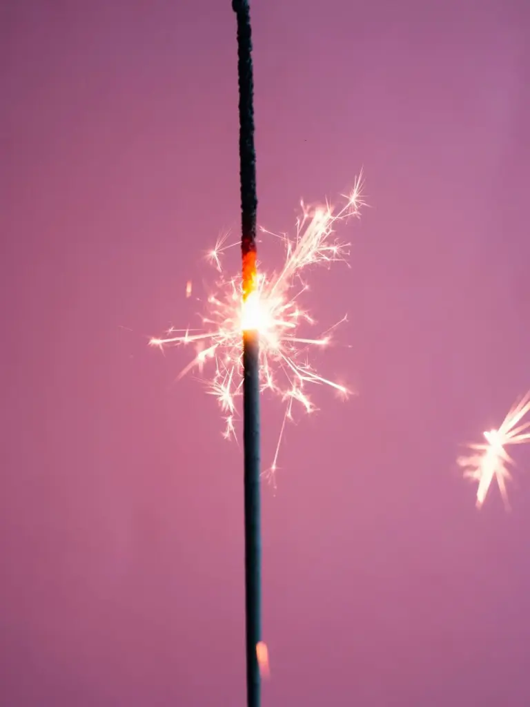
Accent and Sparkle

Accents add the jewelry—small highlights that cue the eye toward art, plants, shelves, or architectural details. Use narrow beams, often 15–25 degrees, with careful aiming that avoids lens glare and distractingly bright scallops. A classic tip is lighting artwork at about 30 degrees to minimize reflections. Introduce a few crisp points, then stop; restraint feels expensive. Add delicate sparkle with miniature spots or tiny pendants that glint, not glare. When highlights are intentional and rare, everything around them seems more valuable.

Scenes and Dimming That Set the Mood in Seconds

Upscale spaces feel composed because the light adapts as quickly as your intentions. Scene controls let you recall precise dim levels and color temperatures with one touch, shifting a room from vibrant to intimate in a graceful fade. Dim-to-warm LEDs make evenings cozy without amber gels, while tunable white supports day-to-night energy. Smooth, flicker-free dimming calms the nervous system and flatters materials. When transitions are curated and predictable, guests feel that someone cared enough to orchestrate comfort, timing, and subtle rhythm.

Five Essential Scenes

Start with a simple, memorable set: Morning, Day, Evening, Dining, and Cleaning. Morning lifts energy with cooler tones and moderate brightness. Day balances productivity and clarity. Evening leans warm, lowering contrast and volume. Dining focuses accents and softens ambient spill for intimacy. Cleaning briefly boosts uniform brightness to reveal crumbs and corners, then politely returns to calm. One-tap recall avoids fussy adjustments, ensuring every activity has a confident, repeatable look that feels considered, not improvised, no matter who presses the button.

Dim-to-Warm vs Tunable White

Dim-to-warm LEDs naturally shift from bright neutral to candlelike warmth as you dim, imitating incandescent romance without wasting energy. Tunable white decouples intensity from color, mapping precise Kelvin values for focus or relaxation at any brightness. Choose dim-to-warm when simplicity and mood are primary, especially in dining and lounges. Choose tunable white for offices, multipurpose rooms, or wellness goals needing circadian-friendly schedules. Both require quality drivers for smooth fades. Pick the approach that suits your routines, then program dependable, delightful transitions.

Curated Transitions

The difference between ordinary and luxurious often lives in the fade time. A two-second segue feels purposeful; abrupt jumps feel mechanical. Use gentle ramps when recalling scenes, longer fades when moving to evening, and almost imperceptible shifts overnight. Consider transitional moments—pre-dinner, post-movie, or late arrivals—so light anticipates behavior. Avoid large relative jumps in one zone while others lag; synchronize the experience. When scenes glide, people relax faster, voices lower naturally, and even modest furnishings gain a cinematic, attentive glow that lingers.

Smarter Controls, Seamless Experience

Great controls feel invisible. Engraved keypads, occupancy sensors, daylight harvesting, and subtle apps collaborate to deliver comfort without complexity. Use just enough buttons, with clear labels and consistent placement, so guests intuitively understand the space. Combine timeclock schedules with motion and light sensors to keep energy honest and ambience steady. Whether you prefer Lutron, KNX, Casambi, Hue, or Matter-enabled ecosystems, reliability and graceful dimming matter most. When controls behave predictably and quietly, people stop noticing technology and start noticing each other.

Keypads You’ll Love to Touch

Choose keypads with satisfying tactility, clean engraving, and restrained options. Fewer buttons signal confidence; four well-chosen scenes beat a crowded grid. Keep locations consistent—near entries, bedside, and at the end of islands or hallways. Provide a discreet all-off for quick exits. Backlighting should be a whisper, not a shout. If voice control is available, let it complement, not replace, physical controls. The best interface is one you forget, because it mirrors your habits and always does exactly what you expect.

Presence, Vacancy, and Daylight Harmony

Occupancy sensors turn on when people arrive; vacancy sensors wait for a manual on, then turn off when empty—great for bedrooms and media rooms. Add daylight sensors to trim artificial light when the sun is generous, preserving scene balance and saving energy. Blend sensor logic with time-based rules to avoid late-night surprises. Calibrate thoughtfully; sensors that trigger too easily erode trust, while sluggish responses feel unhelpful. When tuned correctly, the space seems attentive, welcoming, and surprisingly elegant without calling attention to itself.

Wireless or Wired, Choose Wisely

Wireless systems using Zigbee, Thread, or Bluetooth Mesh install quickly and adapt beautifully during renovations. Wired backbones like DALI-2, DMX for color, or KNX excel in large projects needing robust, deterministic behavior. Hybrids often shine: wired spines for reliability, wireless edges for flexibility. Prioritize fixtures with excellent drivers and verified dimming curves, regardless of protocol. Ensure your gateway supports secure updates and backups, and keep documentation simple. The goal is always the same—smooth fades, dependable scenes, and controls that vanish into the experience.

Color, Materials, and the Perception of Luxury

CCT for Stone, Wood, and Metal

Marble and cool stone feel crisp around 3000–3500K, while walnut and leather luxuriate near 2700–3000K with dim-to-warm evenings. Brushed brass likes low-angle accents that avoid harsh specular flashes. Stainless benefits from diffuse ambient and judicious highlights to prevent streaky reflections. Keep one dominant baseline, then layer accents with intent. If art introduces bold hues, prioritize accurate rendering over color tricks. Remember: contrast is a spice—use enough to define edges and depth, not so much that the eye tires or loses comfort quickly.

High CRI, High Confidence

Fixtures with 90+ CRI and robust R9 values reveal subtle reds in skin tones, meats, and textiles, preventing the grayish cast that cheap light introduces. Color fidelity builds trust—guests feel healthier, meals look appetizing, and clothes read true. In retail or dressing areas, aim even higher if possible. Consistent binning and driver quality matter as much as published specs, so request samples and compare under real conditions. When colors appear honest yet flattering, spaces feel quietly expensive because nothing fights the eye’s expectations.

Taming Reflections and Shadows

Control reflections by adjusting beam angles and shielding. Glass tables, lacquered cabinets, and stone counters benefit from offset lights that graze rather than blast straight down. Use asymmetric wall washers to avoid scalloping, and soften multiple shadows with layered sources at different heights. If glare appears, raise ambient slightly or deepen fixture cutoff. In mirrors, place vertical lights at face height to eliminate unflattering downlight shadows. Gentle, predictable shadows sculpt dimension, while disciplined reflections turn shine into glow—a subtle difference the brain reads as luxurious.

Architecture Meets Optics

Great fixtures respect the room’s bones. Beams, baffles, and trim details shape how light feels before color or controls even matter. Choose narrow beams for art, medium for general coverage, and wash optics for walls. Deeply regressed downlights reduce glare and look tailored. Cove and slot lighting can float ceilings, extend walls, and clarify geometry. Track and micro-spot systems add adjustability without visual clutter. Above all, coordinate fixture cut-sheets with plans early, then mock up real scenes so the promise matches the lived result.

Real-World Wins and Your Next Step

Stories reveal what specs can’t. A neighborhood bistro softened overhead glare, added dim-to-warm pendants, and pre-set four scenes; average checks rose as tables lingered longer. A small apartment gained calm by washing walls, dimming overheads, and spotlighting a plant. Your wins can happen tonight: swap high-CRI lamps, lower ceilings two notches, brighten walls slightly, and program a welcoming evening fade. Share your before-and-after impressions, ask questions, and subscribe for field-tested checklists. Together we’ll refine details until your space feels unquestionably elevated.

A Restaurant That Softened the Edges

The owner thought fixtures were the problem, but it was contrast. We dimmed overhead downlights, added narrow accents to the bar bottles, and introduced warm pendants over tables. Scenes shifted every hour, easing toward intimate without ever going dark. Guests stopped shielding their eyes, conversations softened, and photos looked cinematic. The final tweak was raising wall brightness a touch to expand perceived volume. The menu didn’t change, yet the room tasted better—proof that lighting seasons hospitality as surely as salt seasons food.

Apartment Entryway, Instantly Refined

A narrow entry felt cramped and stark. We installed a shallow cove to lift the ceiling, added a 20-degree spot to a framed print, and swapped the lamp for a high-CRI bulb at 2700K. The mirror stopped glaring once we offset the ceiling fixture and increased ambient slightly. A single keypad with Welcome, Evening, and All-Off simplified behavior. Friends now comment on the calm before seeing anything else. The space did not grow, yet it greets like a discreet boutique—measured, warm, and confident.
Rumelinuvepililu
Privacy Overview

This website uses cookies so that we can provide you with the best user experience possible. Cookie information is stored in your browser and performs functions such as recognising you when you return to our website and helping our team to understand which sections of the website you find most interesting and useful.